AI Recommendations
Roles: UX designer, UX researcher & UI designer

Setting the scene
Ascenda, a provider of loyalty solutions for financial institutions and fintech companies, recognised the need to evolve their offerings to maintain competitive advantage in the market. With industry competitors advancing their technology and the growing prominence of AI across the financial services sector, Ascenda identified an opportunity to integrate AI-powered recommendations into their loyalty platform. This strategic enhancement enables their solution to anticipate users' needs based on historical transaction and engagement data, delivering more personalised experiences that drive higher program engagement and value for their financial institution clients.
🎯 Objective
The recommendation feature aimed to suggest potential customer segments and targeted campaigns that users can create within the platform, streamlining the decision-making process with data-backed insights. By identifying opportunities for personalised engagement based on behavioural patterns and transaction history, these AI-powered recommendations enable loyalty program managers to craft more relevant offerings with less manual analysis. This enhancement not only improves operational efficiency for Ascenda's clients but also drives higher engagement and retention rates within their loyalty solutions platform.
Wireframing
The recommendations functionality was strategically integrated across 3 core areas of the Admin Panel - the Dashboard, Segments, and Campaign features.
Option A

Option C

In evaluating the recommendations placement on the dashboard page, I developed 3 strategic approaches for consideration.
Options A and B both positioned recommendations directly within the dashboard interface, establishing high visibility and immediate discoverability for users.
Option A placed recommendations above existing metrics, which created a clear hierarchy but pushed critical content below the fold, potentially compromising accessibility.
Option B implemented a 2-column layout with metrics on the left and recommendations on the right, providing clear visual separation but significantly extending page length and forcing important metrics below the visible area.
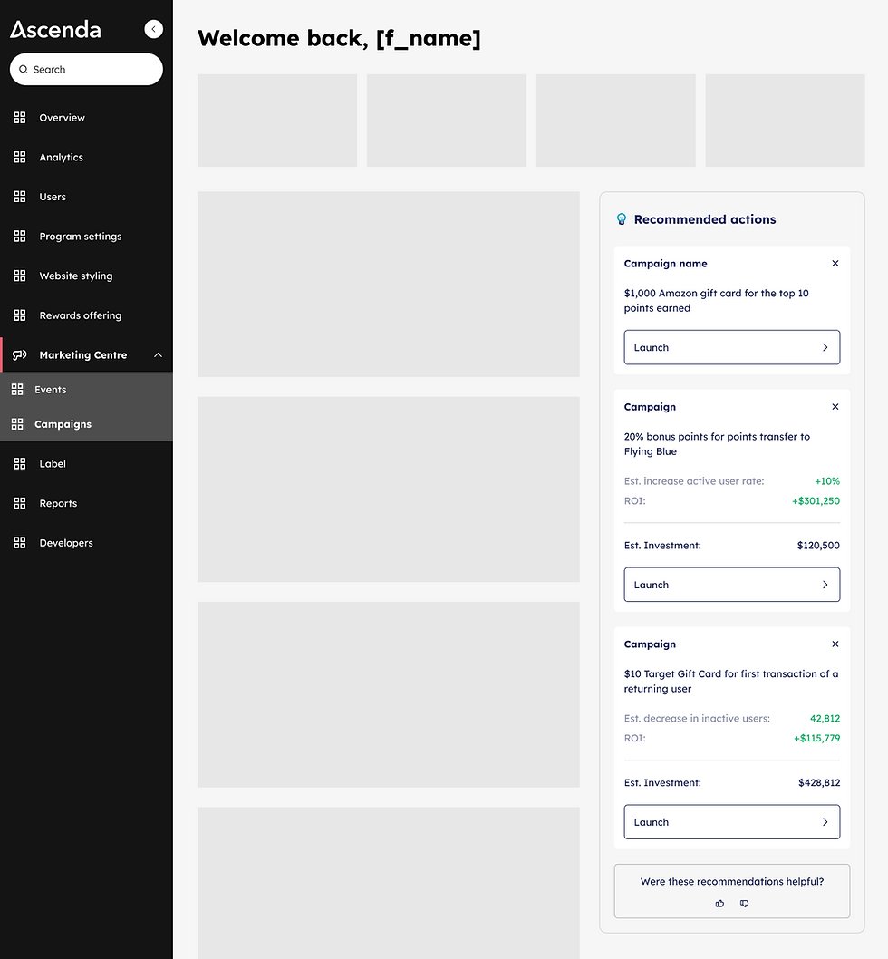
Option C introduced a fundamentally different interaction model by requiring users to actively click to view recommendations, ensuring that engagement with AI-suggested actions remained an intentional choice while preserving the dashboard's information density and maintaining all critical metrics within the visible viewport.
Option A
Option C
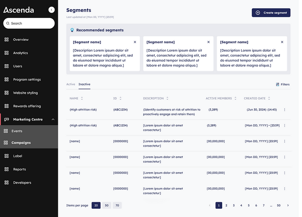
In evaluating designs for the segments and campaigns pages, 3 distinct approaches were considered for recommendation placement.
Option A positioned recommendations above the existing segments/campaigns list, which undesirably extended page length and placed disproportionate emphasis on recommendations within the information hierarchy.
Option B integrated recommendations directly within the existing content list, controlled by a toggle switch for visibility. While this approach maintained a more compact page height, it created several usability concerns: it listed recommended items above existing content, lacked sufficient visual differentiation between recommended and existing items potentially causing user confusion, and risked pushing important existing listings below the visible area when multiple recommendations were present.
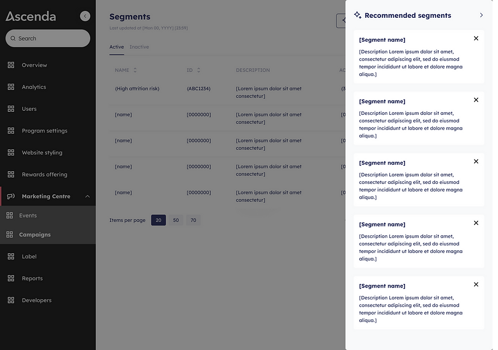
Option C implemented recommendations within a side drawer accessed via a secondary button, requiring an additional user interaction but delivering significant benefits through clearer information hierarchy and reduced cognitive load, ultimately creating a more intentional and focused recommendation experience.
Option B
Option B

✨ Final solution
After discussion with the product managers and developers, we decided to go with the following designs.
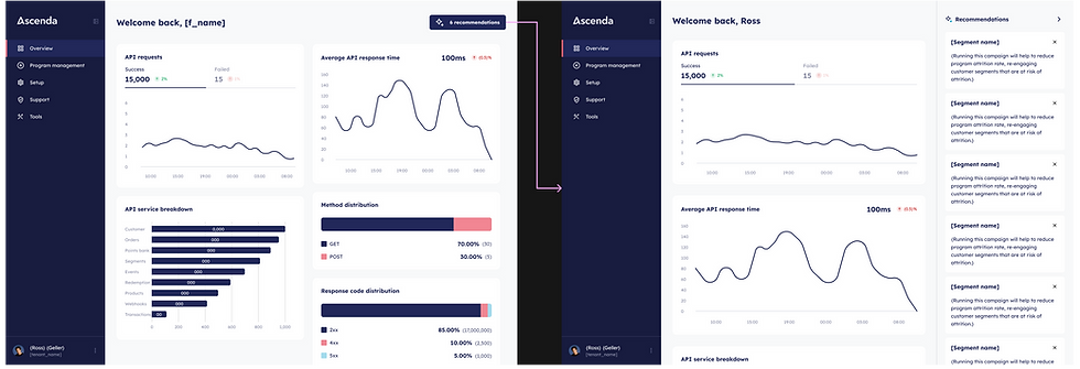
On the dashboard page, Option C was chosen. Recommendations were strategically accessed through a side sheet that appeared when users clicked the Recommendations primary button. This intentional interaction pattern ensured that valuable insights were available on demand rather than competing for attention within the main interface, promoting a cleaner information architecture and reducing cognitive overload. The side sheet implementation served a dual purpose by changing the dashboard layout from a 2 column to 1 column layout, this enabled users to simultaneously view dashboard metrics alongside the AI-generated recommendations. This allowed users to make more informed decisions by directly comparing suggested actions against current performance indicators.

On the segments and campaigns pages, Option C was chosen. Recommendations were accessed through a side drawer that appears when users clicked the recommendations secondary button. Similar to the dashboard page, this implementation maintained the principle of intentional interaction, ensuring that insights were available only when explicitly requested, thus preserving a clean information architecture and minimising cognitive load.
Unlike the dashboard's side sheet, this side drawer overlayed the existing page with a scrim background, deliberately directing the user's focus to the recommendation content. This distinct approach was selected because, unlike the dashboard context, the underlying information on the segments and campaigns pages provided less relevant context for recommendation-based decisions, making the focused overlay design more appropriate for these particular workflows.
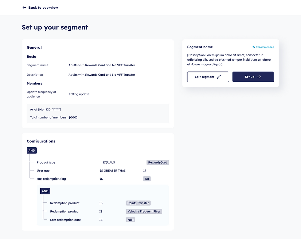
Upon selecting a recommended segment or campaign, users were directed to a summary page where pre-configured settings were presented and ready for implementation. This streamlined approach provided users with 2 distinct pathways forward: they could either launch the AI-recommended segment or campaign immediately with its optimised default configurations, or they could use these pre-set parameters as a foundation for further customisation. This flexibility empowered users to benefit from data-driven recommendations while still maintaining complete control over the final execution of their loyalty program strategies.
Recommended projects

API Analytics

Content Management System
