Website Editor
0 to 1 project
Roles: UX designer, UX researcher & UI designer

PROBLEM
This is too tedious and not scalable for the company 😰
Having partnered with global banks for years, Ascenda recognised clients' need to align rewards platforms with their specific branding guidelines. However, as the company grew and signed more deals, the demand for custom platforms was becoming difficult to manage and made it difficult for the product to scale.
SETTING THE SCENE
Who is Ascenda?
Ascenda is a loyalty solutions provider that offers a suite of rewards programs for financial institutions.
Their goal for the Admin Panel product was to create a self-service platform for their clients to customise their rewards program for their customers. With that, one of the features the company wanted to develop was a Content Management System for clients to customise their rewards platform to meet their company brand guidelines.
OBJECTIVE
We want to enable customisable options while ensuring component scalability
Hence, the objective of this feature was to "enable our clients to have ownership & autonomy on the look and feel of their rewards platform while maintaining the same components used throughout our rewards suite to ensure scalability for the company."
We worked in an agile environment consisting of 2 major design milestones to reach our current functioning product.
MARKET RESEARCH
What can we learn from other website editors?
I started with market research to look into content management systems that already exist in the industry such as Wix and Shopify. This research aimed to identify valuable learnings, best practices, and potential gaps that could inform our product development strategy.
Key insights from our research revealed the overall direction we wanted our product to take and how information was structured and used throughout both sites.

Overall direction for the product
We determined that offering extensive layout flexibility like Wix would compromise our ability to maintain the product effectively. We adopted an approach balancing customisation with system integrity. Our solution allows clients to modify styling attributes of pre-engineered components, maintaining structural consistency while accommodating brand-specific requirements—optimising both system stability and customisation needs.

Information architecture
Analysing industry leaders Wix and Shopify revealed a key principle: separating brand guidelines/themes from content construction. This decoupling enables consistent colour schemes while centralising theme management in one location. It eliminates the inefficiency of modifying individual components across pages when design requirements change. This separation between presentation and content became fundamental to our product development.
USER RESEARCH
Ability to view real-time design changes is essential
We gathered insight from creative designers with experience using other website editor tools such as Wix, Mailchimp and Shopify and we highlighted 2 main themes:

Ability to view real-time design changes was essential
Participants emphasised the critical importance of real-time preview functionality, which serves 2 key purposes: ensuring accurate representation of their design concepts and enabling early identification of potential scalability concerns through visual assessment.

Ability to clearly identify what they were editing
Participants noted that the extensive number of editable components within website editors can become overwhelming. Therefore, it is essential that the platform provides intuitive navigation, enabling users to easily identify and seamlessly modify their target components.
✏️ Wireframing
After gathering the insights, started on the MVP version of the website styling feature.
Following the market research analysis, I designed an information architecture that strategically separates the branding page from the main site editor, which contains all editable pages within the rewards portal. This separation enables users to implement design changes efficiently while ensuring consistent visual identity across the entire portal.

Feature: Branding
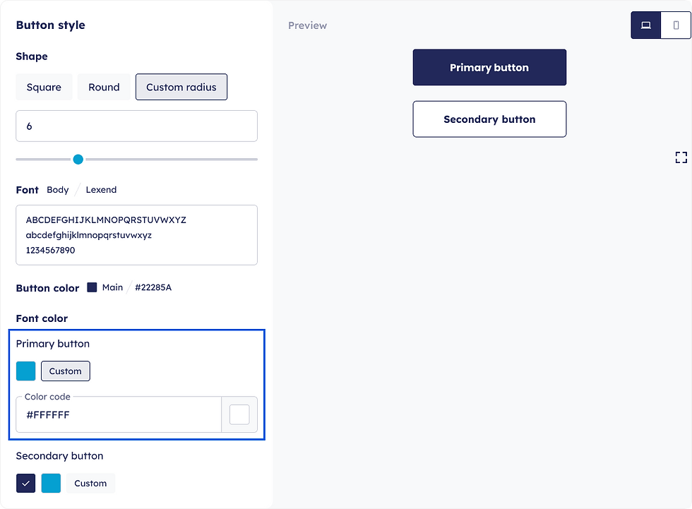
The branding page allows users to upload various assets including logos, favicons, brand fonts, colour schemes, and button styles for their customised rewards portal.
Since branding is fundamentally visual, we prioritised ensuring users can effectively preview their selected branding guidelines within this feature. This informed several key design decisions:
The implementation of the colour pickers that display both visual previews and hex code values to ensure users clearly understand their selections. Additionally, I incorporated a button style preview that enables users to maintain visual consistency between their main website and rewards portal.
On top of this, consistent with our Admin Panel design philosophy, we provide users with industry-standard recommended button styles to streamline decision-making and reduce user effort. While offering these curated presets, we maintain flexibility through a custom style option for personalisation.
The "Save Changes" function efficiently applies branding modifications across all pages, minimising redundant work while maintaining design consistency throughout the rewards portal.
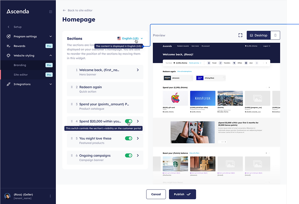
These established branding guidelines are then systematically implemented across the site editor, which houses all editable pages within the rewards portal.


In designing the site editor, we established 2 primary design objectives:
1. Real-time visualisation of changes
We implemented a single-page approach featuring a dual-column layout for optimal functionality. This configuration enables users to simultaneously modify content in the left column while observing the immediate results in the right preview panel. This real-time feedback mechanism allows users to efficiently evaluate the effectiveness of their inputs and make appropriate adjustments as necessary.
2. Enhanced component navigation and editing experience
To facilitate seamless reference between editing controls and their corresponding visual elements, we engineered the preview section to automatically align with the component being edited. This synchronisation strengthens the visual relationship between editing controls and their associated preview elements. Additionally, recognising the substantial content volume requiring navigation, we implemented collapsible component sections. This design decision allows users to focus on individual components while significantly reducing vertical scrolling requirements.
USER RESEARCH
Too much information on the page and I did not understand the terms used
After this MVP version, we gathered feedback from key stakeholders of the feature. Based on the feedback we gathered from key stakeholders, there were 2 main themes that we wanted to tackle in our next iteration:

Users felt overwhelmed by the information required to be filled in
The key stakeholders mentioned that they felt the design housed too much information in 1 page which required them to scrolled a lot to find the components they were looking for.

Usage of non user-friendly terminology
The key stakeholders felt like the use of industry terms hero carousel and quicklinks to label the left widget made it difficult for them to identify the components that we are referring to in the right preview section. This was due to the lack of exposure to these industry terms and may only be easily understood by product designers, developers or people in the industry.
After tackling these 2 themes, we came up with a new design for the website styling feature:
.png)


Terminology accessibility issues
I implemented a more intuitive labelling system that prioritises visual recognition over technical jargon. Establishing a stronger visual connections by using preview text as section headers, creating clear correspondence between the component selector and its visual representation. Additionally, we implemented interactive hover states that highlight the relevant preview section when users navigate the component selector. This enhancement further reinforces the spatial relationship between editing controls and their associated visual elements.

Information density and cognitive load
I transitioned from a single-page to a two-page architecture. This approach requires users to deliberately select specific sections for editing, enabling focused attention on individual components. By facilitating this selective engagement, users can consolidate their thought processes, make more informed decisions, and experience reduced cognitive burden.
Following these architectural and interface modifications, we conducted a series of moderated usability tests to evaluate effectiveness and gather data on remaining implementation questions.
USABILITY TEST
How can we improve?
For this moderated usability evaluation, we collected feedback from 6 participants representing diverse professional backgrounds:
👩🏻🎨
Creative designers
These participants brought extensive experience with various content management systems and design tools, providing valuable industry perspective and functional insights based on their professional expertise.
🫱🏻🫲🏼
Relationship managers
These participants maintain regular communication with our key stakeholders, offering critical insights regarding user experiences and collected feedback from client consultations.
👨🏻💻
Developers
These participants contributed technical expertise, providing alternative perspectives on product utilisation patterns among technically-proficient users.
The evaluation yielded several actionable insights for our final feature iteration:
84.3% of participants identified optimal placement for the expand icon at the top of the preview section
Participants noted reduced visibility at bottom position, reporting increased visual complexity
84.3% recommended highlighting active sections in the preview panel during component editing
Participants emphasised subtle modifications require enhanced visual indicators to confirm changes
33.3% anticipated language selection in the left column rather than top-right
Technical constraints limiting language switching could create confusion from the global position
16.7% indicated insufficient interactive affordances for component selection
Participants suggested hover states alone provide inadequate interaction guidance
16.7% recommended supplementary explanatory text for specialized interface elements
Additional contextual information would enhance comprehension without requiring explanation
✨ Final solution
Therefore with the insights we gathered, we came up with the current launched product.

A strategic repositioning of the language switcher to the left component column, to align its placement with its functional scope and applicable content areas.
The device name was added when the device type has been selected to reinforce its active state.
A relocation of the expand icon to the top of the preview section. This consolidates all interactive controls within a single prominent area, enhancing visibility and improving user interface discoverability.
I implemented an additional navigational affordance in the form of a chevron icon to provide clear visual indication of interactive components within the interface.

I implemented a highlighting effect that activates when users access individual component interfaces. This visual emphasis enhances focus on the specific sections under modification, improving editing precision and context awareness.
Tooltips were added upon hover to give more detailed explanation into the functionality of each component.

A font display was added upon font selection to give users a visual representation of the font that will be used throughout the rewards platform.
Tooltips were added upon hover to give more detailed explanation into the options we were offering them.
Recommended projects
AI Recommendations
0 to 1 project

API Analytics
0 to 1 project

Rewards Marketplace
Redesign project