API Analytics
0 to 1 project
Roles: UX designer, UX researcher & UI designer

PROBLEM
How are Ascenda's APIs performing? 🧐
Following years of integration with numerous global banks, clients began questioning the performance and reliability of Ascenda's APIs. To address these concerns and enhance transparency, we developed an API analytics dashboard that facilitates clearer communication and strengthens trust between Ascenda and its clients.
SETTING THE SCENE
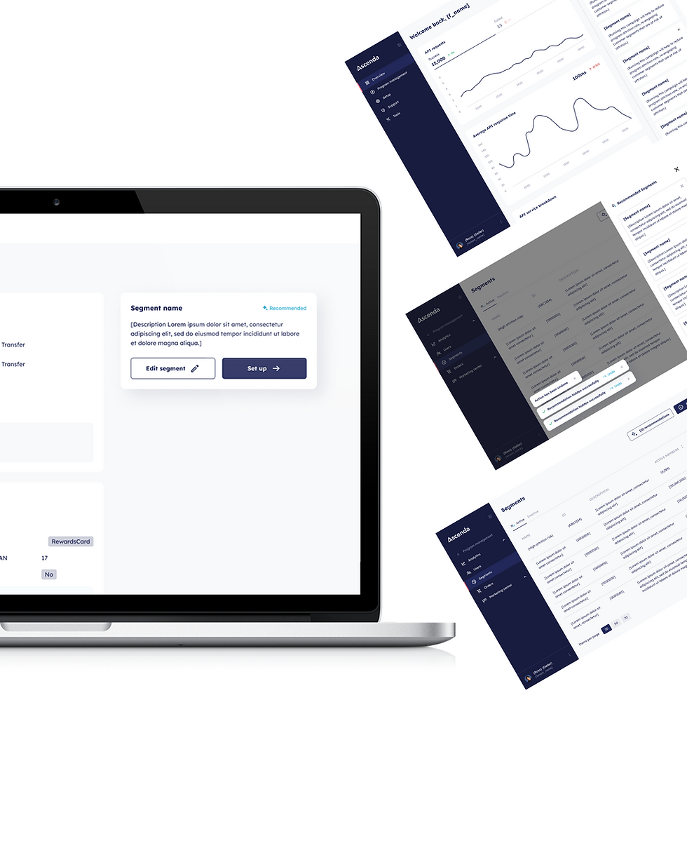
Who is Ascenda?
Ascenda, as a loyalty SaaS provider, offers its customers a comprehensive suite of APIs that enable seamless integration with their loyalty platform. Recognising that these integration points are critical to their clients' business operations, Ascenda understood the importance of providing complete transparency regarding API performance and reliability. This commitment to accountability drove the development of the API analytics feature, giving clients valuable insights into critical metrics.
OBJECTIVE
To empower clients with visibility into Ascenda's API performance
The API Analytics feature was developed with the strategic objective of empowering Ascenda's clients with comprehensive, real-time visibility into API performance metrics. By implementing this monitoring solution, Ascenda demonstrated its commitment to transparency and accountability regarding the quality and reliability of their loyalty SaaS integration points.
✏️ Wireframing
After understanding the requirements, I started on the first version of the API analytics feature.


USER RESEARCH
A balance between numeric values and size visualisation is important
Following the initial design iteration, I conducted a feedback session with both the product and technology teams, yielding valuable insights for refinement:

Percentage over numeric values
The development team expressed a preference for percentage values in the method distribution and response code distribution graphs, enhancing their ability to quickly assess proportional data.
.png)
Over-reliance on bar graph lengths
Stakeholders noted difficulty in comparing values within the API service breakdown graph without explicit numeric indicators, highlighting a need for increased data clarity.

Disproportionate size-to-value ratio
A potential misalignment in the size-to-value ratio of the response code distribution graph was identified. The significantly higher frequency of 200 status codes compared to 400 and 500 errors could lead to disproportionate visual representation when numeric values are embedded within smaller bar segments.
Additionally, a subsequent contrast test revealed that the initial colour palette did not meet accessibility standards for visually impaired users. This finding underscored the necessity for a more inclusive design approach to ensure equal access to critical data for all users.
%20Retention%20analysis%20graphs.jpg)
✨ Final solution
Therefore with the insights we gathered, we came up with the current launched product.

To enhance data precision, numeric values were added to each bar graph in the visualisation. This addition enables users to make exact comparisons between metrics rather than relying solely on visual estimation of bar lengths, which can be particularly challenging when differences are marginal.

Relocating numeric values to table-like format while highlighting percentages. This approach resolves the size-to-value ratio challenge in the graphical representation while ensuring users maintain immediate access to both proportional and absolute metrics for comprehensive analysis.
The implementation of varied contrast levels in the colour scheme enhances accessibility for visually impaired users, ensuring they can effectively distinguish and interpret the graphical data.
Recommended projects
AI Recommendations
0 to 1 project

Wallet
0 to 1 project

Rewards Marketplace
Redesign project