Rewards Marketplace
Redesign project
Roles: UX designer, UX researcher & UI designer


PROBLEM
How can we optimise our rewards platform's design? 🧐
In 2022, Ascenda launched a new product offering — Gift Cards — which prompted a comprehensive review of existing product pages within our rewards platform. Through this design audit, I identified that incorporating the new offering would compromise design consistency across product pages if we maintained the existing design framework. Consequently, I recognised the need for a complete platform redesign to ensure both design consistency and scalability for future product offerings.
SETTING THE SCENE
Who is Ascenda?
Ascenda, a loyalty SaaS provider, delivers comprehensive rewards platform solutions to financial institutions and FinTech companies. Their platform enables end-users to redeem accumulated loyalty points across various offerings.
The range of offerings included gift cards, flight bookings, points transfers to airline points, hotel bookings and many more. This case study we will be focusing on the Gift Card offering as an example.
OBJECTIVE
Redesign for scalability and design consistency across product pages
As Ascenda expanded its rewards ecosystem and identified the need for a more cohesive user experience, I was tasked with redesigning the reward offering pages. This strategic initiative aimed to streamline the user journey, enhance platform scalability, and create a more consistent experience across the entire redemption ecosystem.
👀 Design review of previous iteration
My redesign process began with an evaluation of the previous product iteration and through that I identified critical opportunity areas that would drive significant user experience improvements. This diagnostic review established foundational priorities that guided my strategic design decisions throughout the project.

Overall inefficient use of horizontal space
Inefficient use of vertical space
When information is expanded, the content redemption options were pushed down the page.
Due to the fixed values gift cards can offer, users were not sure of the values the brands were offering.
Main CTA was pushed to the bottom of the page

Page length is relatively long and may cause it to be difficult to find information on the page
Information that was not necessary for the users to know to make a decision was placed at the top of the page.
Main CTA was pushed below the fold
Following the analysis, I identified 3 critical areas for improvement to guide the redesign:

Information architecture optimisation
Analysis revealed a misalignment between user information needs and the existing hierarchy. I prioritised restructuring the information architecture to create logical pathways that better support user decision-making and facilitate more efficient redemption journeys.

Mobile experience enhancement
The excessive page length on mobile devices created unnecessary cognitive load, potentially impeding successful redemptions. My redesign focused on condensing critical information and streamlining the mobile interface to reduce friction and improve completion rates.

Spatial efficiency improvements
The desktop experience failed to leverage available screen real estate effectively, resulting in excessive scrolling and suboptimal navigation. In this redesign, I wanted to develope a more spatially efficient layout that utilised the full width of desktop viewports while maintaining visual hierarchy and reducing unnecessary page length.
✨ Final solution

This image is a visual reference of the design and it is scrollable
Information architecture optimisation
Desktop
I implemented a balanced 2-column layout to establish proper visual hierarchy while ensuring optimal CTA visibility. This architectural decision creates proportional prominence between informational content and actionable elements.
To enhance user access to critical functions, I designed the right column as a persistent sticky widget that retains its position during page navigation. This implementation allows users to simultaneously review detailed product information while maintaining continuous access to redemption functionality, regardless of their position within the content flow. The result is a frictionless experience that facilitates informed decision-making without sacrificing conversion accessibility.

This image is a visual reference of the design and it is scrollable
Information architecture optimisation
Mobile
For the mobile interface, I adapted the core design principles while accounting for device constraints. Rather than replicating the desktop's 2-column structure, I implemented a single-column layout complemented by a persistent primary action button anchored to the bottom of the viewport.
This strategic implementation preserves the essential objective, allowing for comprehensive information review while maintaining constant access to the redemption function. The persistent CTA creates an efficient decision-to-action pathway that accommodates natural mobile browsing behaviours without sacrificing conversion opportunities.

This image is a visual reference of the design and it is scrollable
Mobile experience enhancement
To address information density concerns, I developed a 2-tiered interface architecture that strategically segments content presentation. This approach allows for more digestible information hierarchy while maintaining contextual continuity.
Upon clicking on the primary "Start redeeming" CTA, the redemption options would be revealed through a modal bottom drawer implementation. This progressive disclosure methodology optimised the user experience by:
-
Preserving essential decision-supporting information in the primary view
-
Maintaining persistent CTA accessibility throughout the interaction flow
-
Reducing cognitive load through contextual segregation of complex options
This solution effectively balances comprehensive product information with streamlined interaction patterns, creating a more focused and efficient redemption pathway.
This image is a visual reference of the design and it is scrollable
Spatial efficiency improvements
I implemented a strategic 2-column layout to maximise spatial efficiency and enhance user workflow. The left column was dedicated to providing comprehensive redemption-relevant information, while the right column contained all actionable elements.
This intentional segregation of content and functionality created a clear cognitive pathway for users: information gathering on the left, decision execution on the right. This architecture supported a more intuitive, objective-driven user journey that naturally guided users from consideration to completion of their redemption process.
Recommended projects
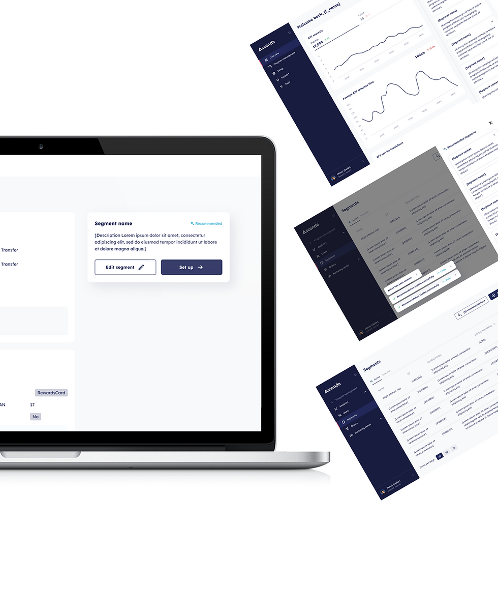
AI Recommendations
0 to 1 project

API Analytics
0 to 1 project

Website Editor
0 to 1 project